
Picture this: You’re sitting in your car, waiting for your daughter’s soccer practice to end, and you decide to quickly Google “massage therapist near me” because your neck has been killing you all week. You click on the first result, and… the website is a disaster. Tiny text you have to squint to read. Buttons so small you can’t tap them without accidentally hitting three other things. You can’t even figure out how to book an appointment.
What do you do? You hit the back button and try the next result.
Sound familiar? Here’s the thing that might surprise you: Google knows this happens ALL the time. They want to make sure their search results are helpful, and when people are hitting the back button because a website isn’t mobile-friendly, that’s a problem.
If your website isn’t mobile-friendly, you’re not just frustrating potential clients—you’re practically invisible to them. Let me explain why this matters so much for your business and, more importantly, how to fix it without needing a computer science degree.
What Is Mobile-First Indexing (And Why Should You Care)?
Let’s start with the basics. Mobile-first indexing sounds super technical, but it’s actually pretty simple. Here’s what it means in plain English:
Google used to look at the desktop version of your website first when deciding how to rank you in search results. Now, they look at the mobile version first. If your mobile site is a mess, your rankings suffer—even when people search from their computers.
Why the switch? Because more than half of all Google searches now happen on mobile devices. People are searching for businesses like yours while they’re out and about, sitting in coffee shops, or lying in bed scrolling on their phones. Google wants to show them websites that actually work on their phones.
The reality is this: if your website doesn’t work well on mobile, Google assumes it doesn’t provide a good user experience. And Google’s whole mission is to show people the most helpful, relevant results. A website that’s impossible to use on mobile? That’s not helpful to more than half of the people searching on Google.
Having a mobile-friendly site isn’t just about rankings, though. When someone finds your website through a mobile search and has a terrible experience, they’re not coming back. You’ve lost a potential client, and they probably won’t recommend you to friends either.
I get it. This might feel overwhelming, especially if you built your website years ago when mobile wasn’t as big a deal. But here’s the good news: making your website mobile-friendly doesn’t have to be complicated or expensive. Let me show you how to check where you stand and what to do about it.
How to Check If Your Website Is Actually Mobile-Friendly
Before we dive into fixes, you need to know where you stand. I’m going to walk you through two simple ways to test your website’s mobile-friendliness. No technical skills required—I promise.
Method 1: Test It Yourself on Your Phone
Sometimes the simplest approach is the best. Pull out your phone right now and visit your own website. That’s it!!

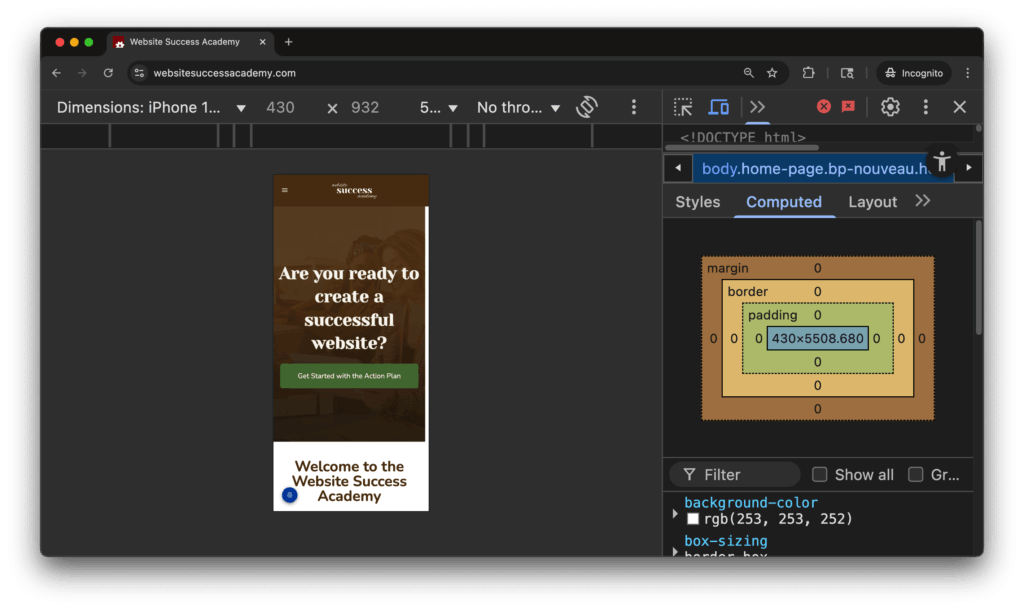
Method 3: Use Chrome Developer Tools
This one’s slightly more technical, but still totally doable. If you’re on a computer, you can simulate how your website looks on different mobile devices. Here’s how:
- Open your website in Google Chrome
- Go to View > Developer > Developer Tools
- Look for a small phone/tablet icon in the top-left corner of the developer panel
- Click that icon to switch to mobile view
- Use the dropdown menu to test different device sizes
This lets you see exactly how your site appears on an iPhone, Android phone, or tablet. You can even test how it looks when someone holds their phone horizontally versus vertically.
Red Flags That Mean Your Website Needs Mobile Help
When you’re testing your site, here are some warning signs that you need to make some changes:
- Tiny text everywhere: If people need to zoom in to read your content, it’s too small. Google recommends text that’s at least 16 pixels, but honestly, bigger is better.
- Buttons and links too close together: If it’s hard to tap the right thing without accidentally hitting something else, your buttons are too small or too close together.
- Slow loading times: If your site takes more than 3 seconds to load on mobile, you’re losing visitors fast.
- Pop-ups that can’t be closed: Those “Subscribe to our newsletter!” pop-ups that cover the whole screen and don’t have a clear way to close them? Google doesn’t like those, and neither do your visitors.
- Horizontal scrolling: Your website should never require left-to-right scrolling on a phone. Everything should fit within the screen width.
Simple Fixes for Common Mobile Problems
The good news is that many mobile-friendliness issues have straightforward solutions. You don’t need to rebuild your entire website from scratch. Often, a few tweaks can make a huge difference.
Making Text Bigger and More Readable
If your text is too small, here’s what you can do:
- WordPress users: Most themes have customization options where you can increase font sizes. Go to Appearance > Customize and look for typography or font settings.
- Other platforms: Check your website builder’s design settings. Look for options like “Typography,” “Fonts,” or “Text Settings.”
Quick tip: Aim for at least 16px font size for your main content. Your headers can be bigger, but your body text should never be smaller than 16px.
Fixing Button and Link Spacing
If your buttons are too small or too close together:
- Make buttons bigger: Aim for buttons that are at least 44 pixels tall—that’s about the size of an adult fingertip.
- Add more space: Put at least 8 pixels of space between clickable elements.
- Use button text instead of tiny icons: Instead of relying on small social media icons, use buttons that say “Follow us on Facebook” or “Call Now.”
Speeding Up Your Website
Slow loading times kill the mobile experience. Here are some quick wins:
- Optimize your images: Large image files are often the biggest culprit. Use tools like TinyPNG to compress your images without losing quality.
- Rethink animations: Those cool animations that look great on your desktop computer might not look so great on a mobile device. Plus, they tend to require a lot of extra code, which could slow down your website. Consider removing animations for an overall better user experience.
- Choose a better hosting provider: If your site is consistently slow, it might be time to upgrade your hosting. Companies like SiteGround or WP Engine are known for faster loading times.
- Remove unnecessary plugins: If you’re using WordPress, deactivate any plugins you’re not actually using. Each plugin can slow down your site.
- Use a caching plugin: Plugins like WP Rocket or W3 Total Cache can significantly speed up your WordPress site.
Rethinking Pop-ups
Pop-ups can be annoying, and they can cause problems not just for mobile but for usability and performance in general, but there are some things you can do make them less intrusive:
- Make them easy to close: Add a “close” button to your pop-up, and make sure you test it on mobile! A lot of close buttons are way too small.
- Add a delay: Give users a few seconds on the website before the pop-up appears.
- Require interaction: Don’t show the pop-up until the user has scrolled a bit.
Making the Website Responsive
A responsive website will automatically adjust its layout to fit the screen. So whether you look at it on a desktop or mobile device, it’ll still look great. If users have to scroll right and left to view your website, there’s a good chance it isn’t responsive, and it might be time to upgrade your theme or template.
When to Call in Professional Help
I’m all about DIY solutions, but sometimes you need backup. Here’s when it makes sense to hire a professional:
- If your website is really old: Sites built more than 5 years ago often need more extensive updates than simple tweaks can fix.
- If you’re not seeing improvement: You’ve tried the basic fixes, but your mobile-friendly test results haven’t improved.
- If you’re losing sleep over this: Your time is valuable. If wrestling with mobile optimization is keeping you from serving clients or spending time with family, it might be worth hiring help.
- If your business depends heavily on mobile traffic: If you’re a local service provider and most of your clients find you through mobile searches, this is too important to leave to chance.
Don’t Forget About Local SEO
Mobile-friendliness is especially crucial for local businesses. When someone searches for “massage therapist near me” or “plumber in Annapolis,” they’re almost always on their phone, and they want to take action quickly. So if you have a local business, make sure your website includes:
- Your phone number: Make it easy to find, and make it clickable so people can call you with one tap.
- Your address and hours: Put these in the footer on every page.
- Simple contact forms: Keep them short and easy to fill out on a small screen.
- Clear calls-to-action: “Book Now,” “Call Today,” or “Get a Quote” buttons that are easy to tap.
The Bottom Line: Your Mobile Experience IS Your Business
I know this might feel like just another thing on your never-ending to-do list. But here’s the reality: in today’s world, your mobile website experience often IS someone’s first impression of your business.
When someone finds your website on their phone and everything works smoothly—they can read your content easily, navigate without frustration, and contact you with one simple tap—you’ve just made their day a little bit easier. And people remember businesses that make their lives easier.
The mobile-first indexing shift isn’t going anywhere. Google has made it clear that mobile experience is a priority, and it’s only going to become more important over time.
Start with the simple test I mentioned earlier. Check your site on your phone right now. If you notice problems, pick one issue and fix it this week. You don’t have to tackle everything at once.
Remember, you don’t need to be a tech expert to have a mobile-friendly website. You just need to care about your visitors’ experience and be willing to make some adjustments.
Your future clients are out there searching for exactly what you offer. Make sure that when they find you, your website welcomes them with open arms—whether they’re on a phone, tablet, or computer.
Want more step-by-step guidance on improving your website’s SEO and mobile experience? Join the SEO Success Club where you’ll get simple, actionable strategies designed specifically for non-techy business owners.